Fact sheet redesign
what, where, & when
UX design architect
D&B Hoovers
Austin, Texas
2011–2012
personas
BI analysts, sales makers, small–medium business owners
tools
AB testing, Omnigraffle, PhotoShop, FireWorks, usability results, user research
keywords
AB testing, information architecture, interaction design, visual design, wireframe
Alex is one of the best designers I have ever worked with. When she creates any design, she considers cognitive, perceptual, and physiological psychology factors as well as basic usability and user experience guidelines and realities. It was truly refreshing to work with her because she thinks about users and designs for them so thoroughly and from so many angles in an era when either coding or visual design are so often the only factors considered.
—Jennifer Ehrlich, PhD, UX Lead, Hoovers (Dun & Bradstreet)
Hoover's company fact sheets were online teasers of detailed business intelligence (BI) reports, bringing in sales revenue for the reports, and sales leads for BI subscriptions. Unfortunately, fact sheets were failing at their job. Here is a classic example of UX transforming cluttered, inconsistent design into a profitable feature. Solid AB test results offer yet another blow to the myth that success metrics must drop after any transformative change.
Not enough revenue
The public D&B Hoovers site was a draw for the paid product, providing a high-level preview of the kind of BI data accessible to paying customers. The free “fact sheet” view of companies not only contained business intelligence, but many calls to action and advertisements.
The business had presented product with some steep goals:
- Increase report purchases by at least 70%
- Reduce bounce at least 10%
- Accomplish the above without losing click-throughs to "Request a Free Trial" and (hidden by tab in the below image) "Buy Report" pages more than 10%
A standard UX audit revealed multiple challenges
Although Hoover's had standardized fonts and colors, they did not have well-established patterns. After searching for a company, a customer's first view of the fact sheet showed:
- No clear delineation between the main content and related content on the page
- Five different versions of related content containers
- A key CTA (call-to-action) in the right-hand advertising column area
More experience and basic usability issues are detailed in the image below. This is the first of six pages submitted as my IA/IxD solution to the product owner. Note that while heuristics are covered, the description's jargon is limited to concepts shared by UX and product.
Please note: While I prefer my designs to be responsive, the fact sheets were overwhelmingly used by customers conducting work on desktop or laptop computers. Hence the strong "above the fold" awareness in the wires below. Responsive was not only not requested but forbidden as a "waste of time." (A hybrid mobile app was eventually developed separately, with a radically different look and feel.)

Goals and UX review, existing fact sheet page (page 1/6). Click on image to see it full-size, in a new tab.
Recommended changes
I performed a UX refresh for the fact sheet, specifically aimed at doing the following:
- Visually integrated company data, setting it apart from global navigation, advertising, and related content and calls to action.
- Added an additional, business-required e-commerce call out.
- Moved company description up to the top to reduce page bounce. (This was previously treated as related content!)
- Visually grouped secondary (company) navigation buttons with content.
- Moved dual call-to-action area further down, as users couldn't make this decision without previously absorbing the content above it.
- Added a "Learn more" tab for more searchable company-specific content.
- Recommended visually integrating ads with page design, to reduce ad blindness. At the same time, the main content had been clearly set apart from both ads and related content, to allow the user to focus on the heart of the page.
High-resolution wireframes
I do three kinds of wireframes: extremely stripped-down Balsamiq (or Visio, or Omnigraffle); high-res almost-comps (like the ones below); and "live wires," a.k.a. prototypes. It all depends on the situation.
Pure IA, stripped down to black-and-white, is perfect for complex flows, or a UI with many different states according to user permissions or roles. An HTML + CSS + JavaScript prototype can demonstrate the value of an interaction much more quickly. Since much of my solution here would be based in eventual visual design, I chose to demonstrate that to better make my case. Once approved, a visual designer would be assigned to finalize look and feel (see below).
Since the fold line mattered for the vast majority of our users, each view shows where the fold line hits.
"Overview" tab
Three big changes here:
- Company details are visually grouped by placement within a shared background. (Essentially this is the tiny, tabbed CTAs from the original writ large, but this is an IA/IxD refresh, so visual design is not finalized.)
- The company overview is right at the top of the content area, not hiding well below the fold.
- The tabbed CTAs are both visible at the same time.
- Initially I wanted the CTA above the advertising column moved to the main content area. Told this was not possible, I extended the background color to incorporate it and set it apart from ads. But as you will see below, this was not the final state.

Click on image to see it full-size, in a new tab.
"People" tab
- The primary CTAs ("Find out more," "Hoover's Free Trial") are shown on nearly every tab. Previously they were only on the top level tab, and one was hidden behind a mini-tabbed interaction.
- The background color follows the main content, keeping it defined from the rest of the page.

Click on image to see it full-size, in a new tab.
"Competition" tab
- "Mini icons" were the team term for inline icons, sadly still based in image files (I'm not even sure they used sprites). Design and development did not communicate as much at Hoover's as at other roles I've held.
- I take whatever opportunities I have to promote good design practices, such as being unafraid of white space.
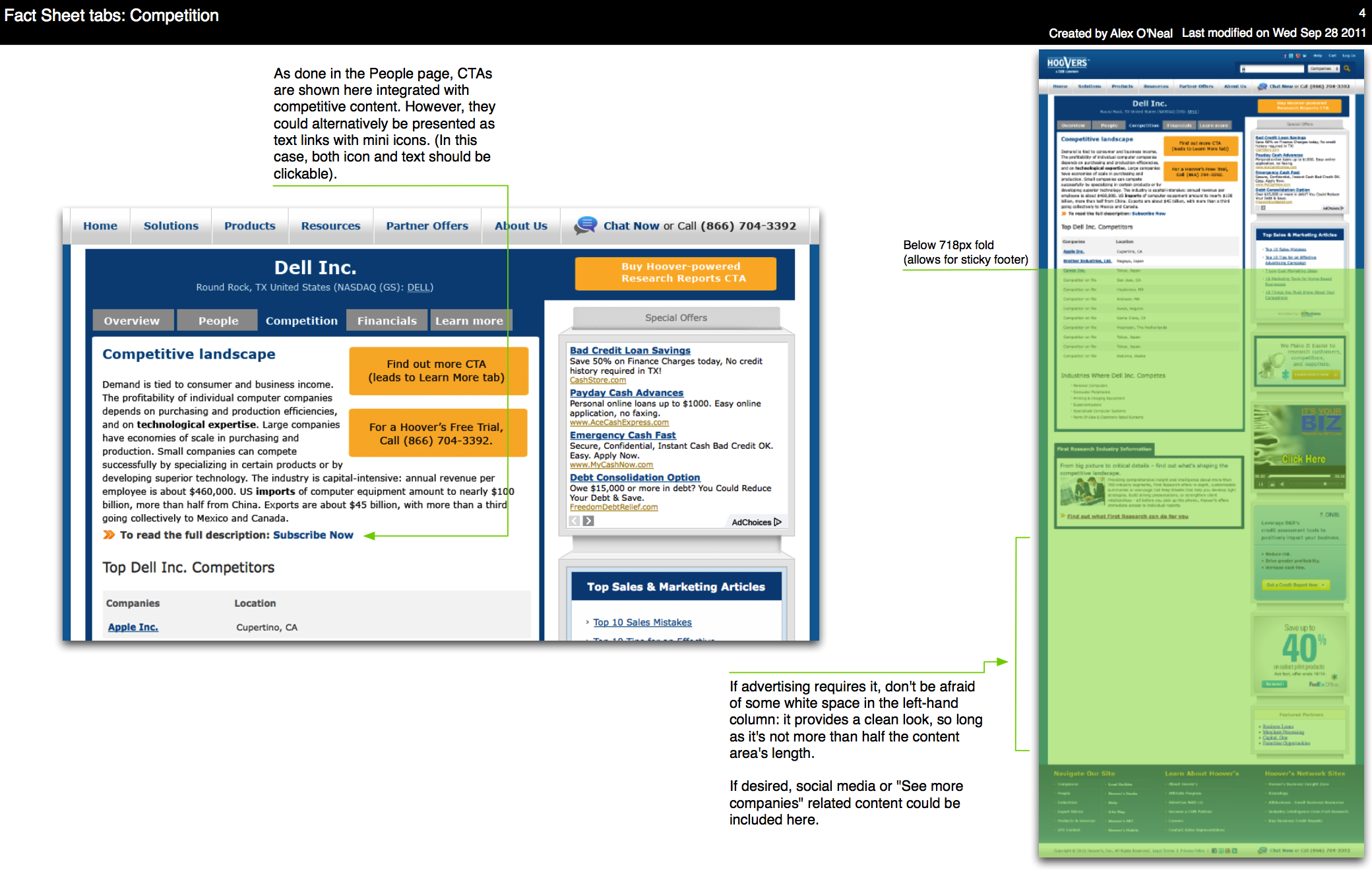
Click on image to see it full-size, in a new tab.
"Financials" tab
- Anchor links lead customers to the financial data they want most.
- Because of the table format used here, I changed a CTA box into a text link with an inline icon.

Click on image to see it full-size, in a new tab.
"Learn more" tab
- In addition to the increased CTA awareness on earlier tabs, a new tab was created to encourage report purchasing and subscription leads.
- A short form initiates a subscription lead. Inline help explains why we ask for an email. Should the user complete it, this data is preserved in a slightly longer form.
- Related company data still shows on this page.

Click on image to see it full-size, in a new tab.
We have a winner!
A/B testing against the original design resulted in not only meeting but exceeding the goals originally set. The newly designed fact sheet page went through multiple percentage tests, up to a 50/50 percent mix with the control. Overall results were outstanding:
- Immediate e-commerce revenue per visitor went up 84%.
- Bounce decreased 3%. This was not the 10% reduction desired, but revenue and lead increases offset it.
- Phone calls went down, but completion of online sales forms increased 33%, generating significantly more overall leads. Minimum phone calls were not an original requirement, but were incorporated into test analysis.
Coding and time limitations prevented all recommendations from being implemented, but the heart of the changes were kept, and a key desired improvement was possible (moving the CTA above the advertising column into the main content area). Visual styling of the above wires was performed by the excellent Casey Decker (see below).

Sorry for the "Test" text; I don't have a copy of the design without that. Click on image to see it full-size, in a new tab.
In case you were wondering
I chose Dell as the example company because it was a frequent search by Hoover's users, and because it is such a strong presence in the Austin Silicon Hills. Who knew I would be working there a little over a year later?