Mobile reporting
Sometimes Dell teams and customers need data on demand, wherever they are. Here's what that can look like.
Please note, none of the dashboard data is real.

Click on image to see it full-size, in a new tab.
Sometimes Dell teams and customers need data on demand, wherever they are. Here's what that can look like.
Please note, none of the dashboard data is real.
Click on image to see it full-size, in a new tab.
Sr. UX architect
Dell
Richardson, Texas
2013–2016
executives, sales makers, anyone requiring data on demand
HTML, CSS, dimple/D3 JavaScript, Sherpa (in-house JS framework)
data visualization, dashboard, mobile, responsive, user testing, interaction design, prototype, accessibility, usability
[Alex] relies on her wealth of experience and knowledge to provide well thought through design solutions. When she does not know something, she learns it; quickly. She does not sit idle and is always learning which makes her a great advocate for a better user experience. If you have a complex UX/UI issue that needs to be solved Alex would be a great choice.
—Jim Machajewski, Director of UX Design, Dell
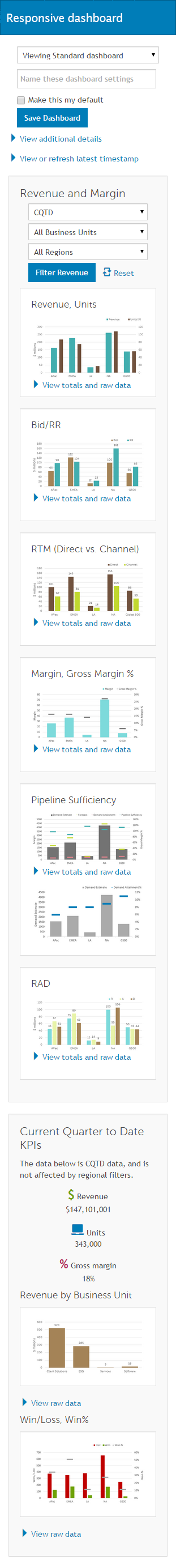
This was my first project for the IT Innovation Team: a mobile dashboard for the ESG (Enterprise Solutions Group). The goal was to provide a prototype that demonstrated options and best practices; could be used in further design and development; and could help define requirements for data visualization vendors, should Dell decide not to develop in-house.
This was a "live wire" prototype using Dell brand styles from Sherpa, an in-house JavaScript framework, with responsive elements from Bootstrap. This approach allowed us to demonstrate concepts, innovations, and interactions quickly and test them, before diving into more detailed visual styling. I no longer have the prototype, but I do have screen shots and one photoshopped image (above) created from the screen shots.
The charts are not the final version, but they follow my self-developed dashboard and data viz accessibility guidelines, later adopted by Dell Brand for all Dell data visualization.
Worth noticing:

Click on image to see it full-size, in a new tab.
Worth noticing:

Click on image to see it full-size, in a new tab.
Lots of scrolling—but then, there's lots of data. This is cropped; click for the entire vertical scroll.
Click on image to see the full vertical scroll in a new tab.