Why jargon matters

career, design
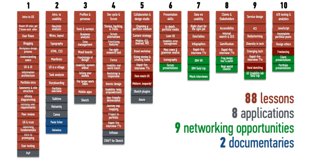
A syllabus from one of my UX classes; just the lesson titles are full of jargon! Each column is a week of lessons and events.

A syllabus from one of my UX classes; just the lesson titles are full of jargon! Each column is a week of lessons and events.

My ex-spouse, bless his heart, contributed some good to my life. (I can say this twenty years later, sixteen years into a marriage to the right partner. About the first one, all I can say is that every relationship sucks if it’s the wrong one, no matter how well-intentioned and good the people involved.)

Possibly the most important good he contributed to my tech career was this advice: “Jargon matters.”

Let me say that again, more loudly:

Jargon matters.

Everyone hates jargon, right? It’s used by some to exclude outsiders and preserve territory (lawyers and doctors, I’m looking at you!), or by others to show off being part of the “in” group at work. Sometimes it’s misused, and depending on the likability of the person making the mistake and the empathy of the observers, colleagues feel one of two excellent German concepts: Schadenfreude (pleasure in another’s misfortune) or Fremdschämen (embarrassment on someone else’s behalf).

Habitual creativity: Turn around

design thinking, inspiration

For a little over two years, I left work and went to a particular bus stop on Elliott & Western in Seattle. So I spent a little time every day looking at this building, near the base of a hill leading up to the Queen Anne Hill area.

Building facing bus stop

One day, for whatever reason, I turned around and looked behind me. Due to an accident of unusual angles (hills, buildings, streets), suddenly I could see everything the building was hiding from me, including the Space Needle!

building-behind-busstop

The beauty of turning around is that it changes your perspective. Sometimes it even shows you the forest for the trees—or in this case, the neighborhood for the buildings.

So how do you turn around, metaphorically speaking? Here are some straightforward and a couple less obvious methods:

  • Try the other person’s perspective on for size. You may not end up agreeing with it, but you’ll understand it better, and this process frequently provides insight into design challenges. You UX people are used to this one. 
  • Are you looking from the outside in, or UI first? Try flipping it. Do the mental exercise of imagining your web application from the back end out – network to content buckets to databases to identifying the right content to surfacing, navigating, and consuming it. Getting a better understanding of the building blocks will let you do more with your Lego.
  • Set yourself challenges that push you beyond your normal boundaries to see the point of view inside someone else’s. For example, find a song you like in all the music genres you can think of.
  • Like sitting alone? Join a group. Like groups? Try taking some time away from them.
  • Reverse the flow. (No, not that flow.) Does your taxonomy go from broad to specific? Why not try specific to broad? Or, put everything on the same level and make it flat. The meaningful concepts will float to the top.

UX design as contract

design, psychology

Back to William James again, and my favorite quote: “My experience is what I agree to attend to.”

Previously I wrote about what this said regarding the range of experience UX designers could leverage to engage users (UX happens everywhere).  But there’s more behind this statement than the observation that where a person’s attention goes, there goes their experience of the world. There’s an ethical responsibility implicit there as well.

What and how we attend to things matters to our quality of life. Psychologists, medical doctors, and Buddhists have known this for some time (Buddhists have known it a bit longer). Focused attention is used in mindfulness-based stress reduction programs for cancer patients; an excessive level of difficulty in maintaining focus is a diagnosable disorder; “right mindfulness” is part of the Buddha’s Eightfold Path. The very process of therapy involves drawing attention to specific patterns of behavior.

But attention isn’t the whole story. If William James is correct, then experience involves not just attention, but an agreement to attend. When a user agrees to give us (UX architects) some of their attention, they are in effect agreeing to make us a small part of their experience of the world. They are allowing us to have an effect on their quality of life, small or large depending on what our product or service is.

As the other half of that agreement, we enter into an unspoken contract with users to make that experience worth their while.


Originally posted on alexfiles.com (1998–2018) on January 2, 2011.

Simplicity is not a goal, but a tool

design, design thinking

Simplicity in design is not a goal by itself, but a tool for better experience. The goal is the need of the moment: to sell a product, to express an opinion, to teach a concept, to entertain. While elegance and optimal function in design frequently overlaps with simplicity, there are times that simplicity is not only not possible but hurts usability. Yet many designers do not understand this, and over the years, I’ve seen the desire to “keep it simple, stupid,” lead to poor UX.

I was therefore glad to see Francisco Inchauste’s well-thought, longer version of Einstein’s “as simple as possible, but no simpler” remark.

From the column:

As an interactive designer, my first instinct is to simplify things. There is beauty in a clean and functional interface. But through experience I’ve found that sometimes I can’t remove every piece of complexity in an application. The complexity may be unavoidably inherent to the workflow and tasks that need to be performed, or in the density of the information that needs to present. By balancing complexity and what the user needs, I have been able to continue to create successful user experiences.

Plus, as I’ve commented before, messy is fun!


Originally posted on former personal blog UXtraordinary.com.