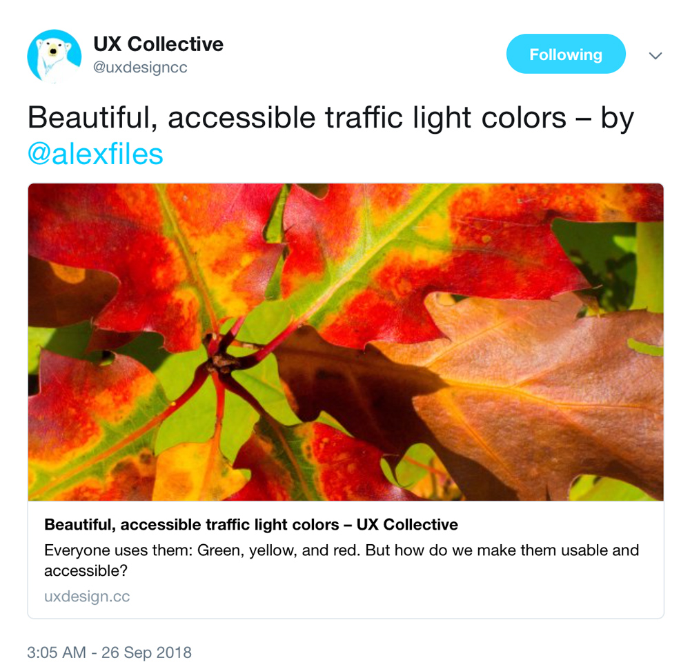
Even better, they tweeted it!
 Screen capture, UX Collective’s tweet.
See the article on UX Collective (or here).
Even better, they tweeted it!
 Screen capture, UX Collective’s tweet.
See the article on UX Collective (or here).
Cross-posted from my Medium blog.

Autumn leaves showing off a glorious red/yellow/green palette. Photo by enneafive of Flickr, under Creative Commons by 4.0 license. Links below.
Everyone uses them: Green, yellow (or orange), and red. We use them in data visualization, we use them in buttons, we color text and icons with them and put them into alerts. They are often used in crucial moments, when we are announcing success, or breaking bad news. We abuse them, too, using them to draw attention where they aren’t relevant. What we don’t do, far too often, is make them accessible.
A significant minority of people are color blind, and most of those have red-green color blindness. Since 2011 I’ve had to solve for color accessibility in important interactions, such as alerts for patient vitals, quality of patient care, cloud server status, or executive sales analytics. Here are some accessibility tips I’ve picked up along the way, as well as my personal template for a usable, accessible traffic color palette.